
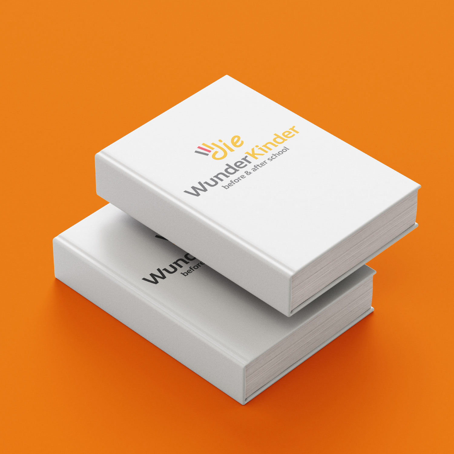
Visual Identity Concept
Die Wunderkinder
The brand is dedicated to before & after school programs, with a focus on the German language, so the identity needed to inspire trust in parents while remaining warm and accessible to children.
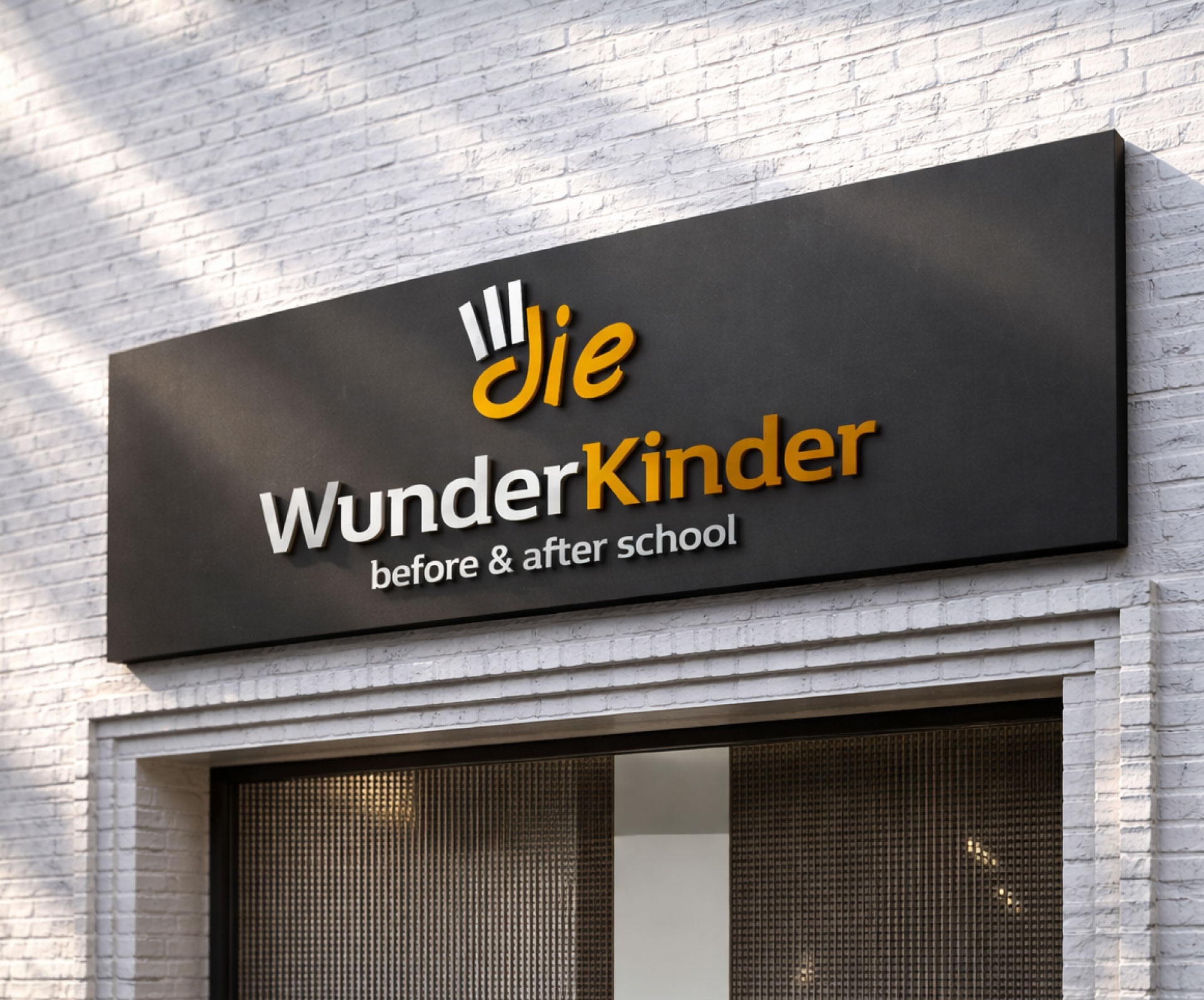
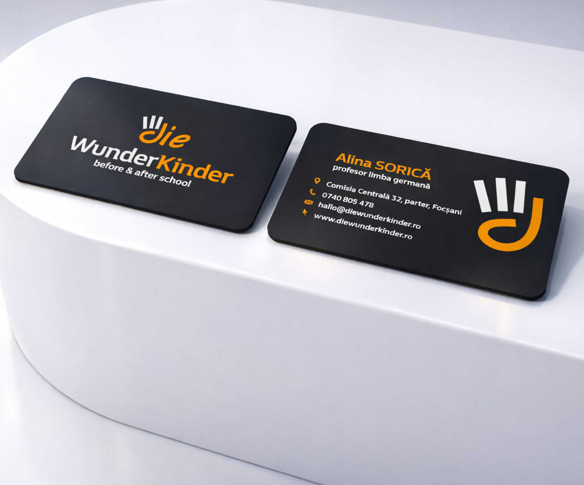
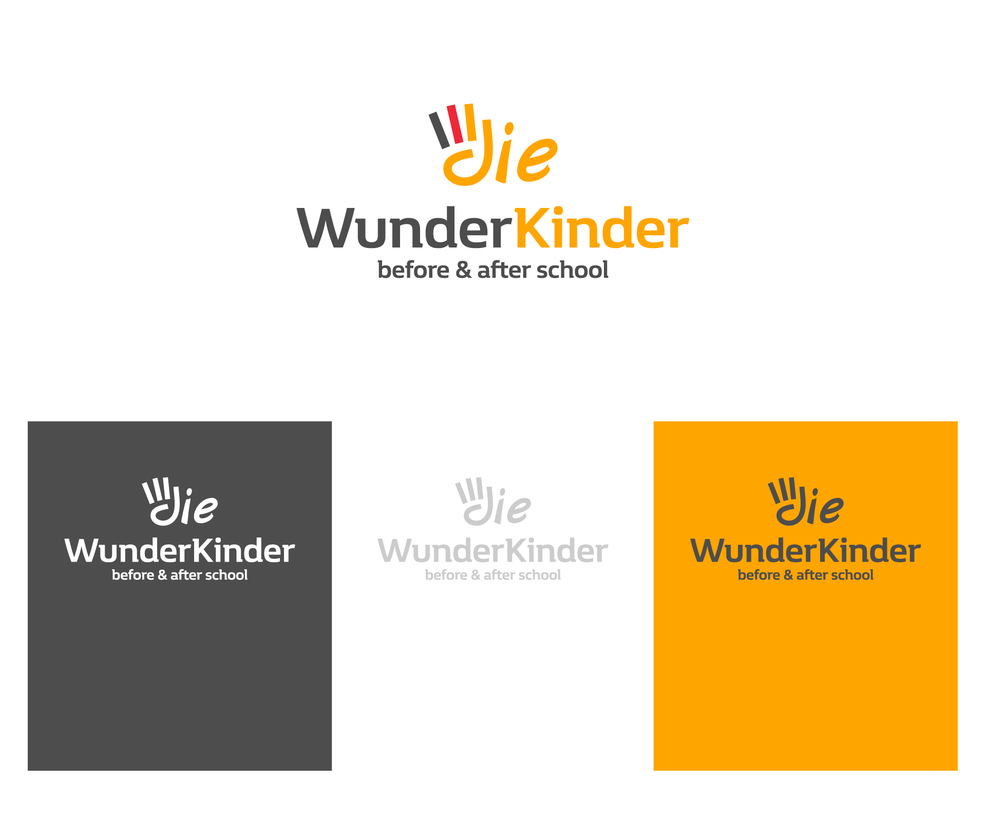
The graphic symbol suggests a raised hand—participation, engagement, and a desire to learn. At the same time, the shape is naturally integrated into the word “die,” making it memorable and easily recognizable.
The typography combines stability with dynamism. “Wunder” is presented in a neutral tone to convey structure and seriousness, while “Kinder” is highlighted with color, emphasizing energy and optimism.
The color palette is no accident. The combination of dark gray, red, and yellow-orange subtly references the German flag, reinforcing the connection to the language being studied. This makes the visual identity not just an aesthetic exercise but a clear positioning element.
The logo was designed to work consistently in both print and digital formats, maintaining readability and impact in any context.
It’s an identity that speaks of discipline, growth, and a structured yet friendly educational environment.
Clients
Die Wunderkinder
Services
Branding
Year
2022