Pro Packing Adventure
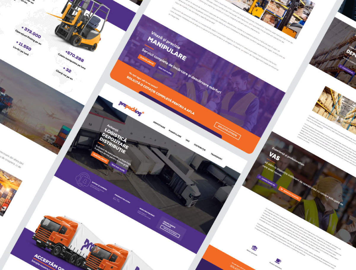
LOGISTICS. WAREHOUSING. DISTRIBUTION. Since 2018, Pro Packing has given us the opportunity to help craft a captivating and authentic story that truly represents them. Throughout this time, we developed a vibrant and minimalist identity, an engaging website, and on-site elements that convey their unmistakable professionalism.
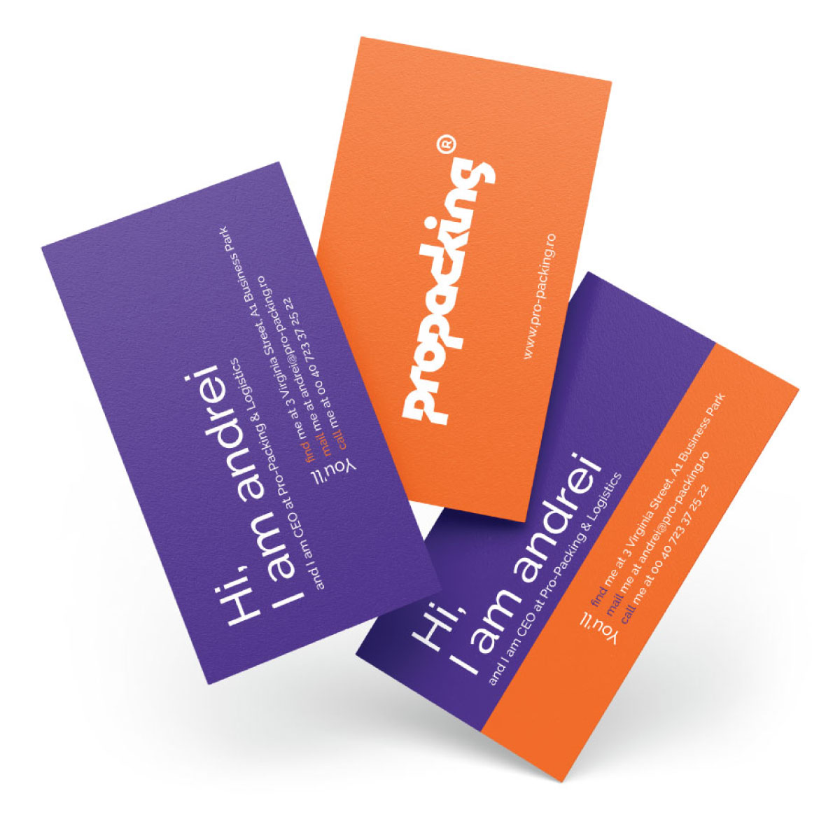
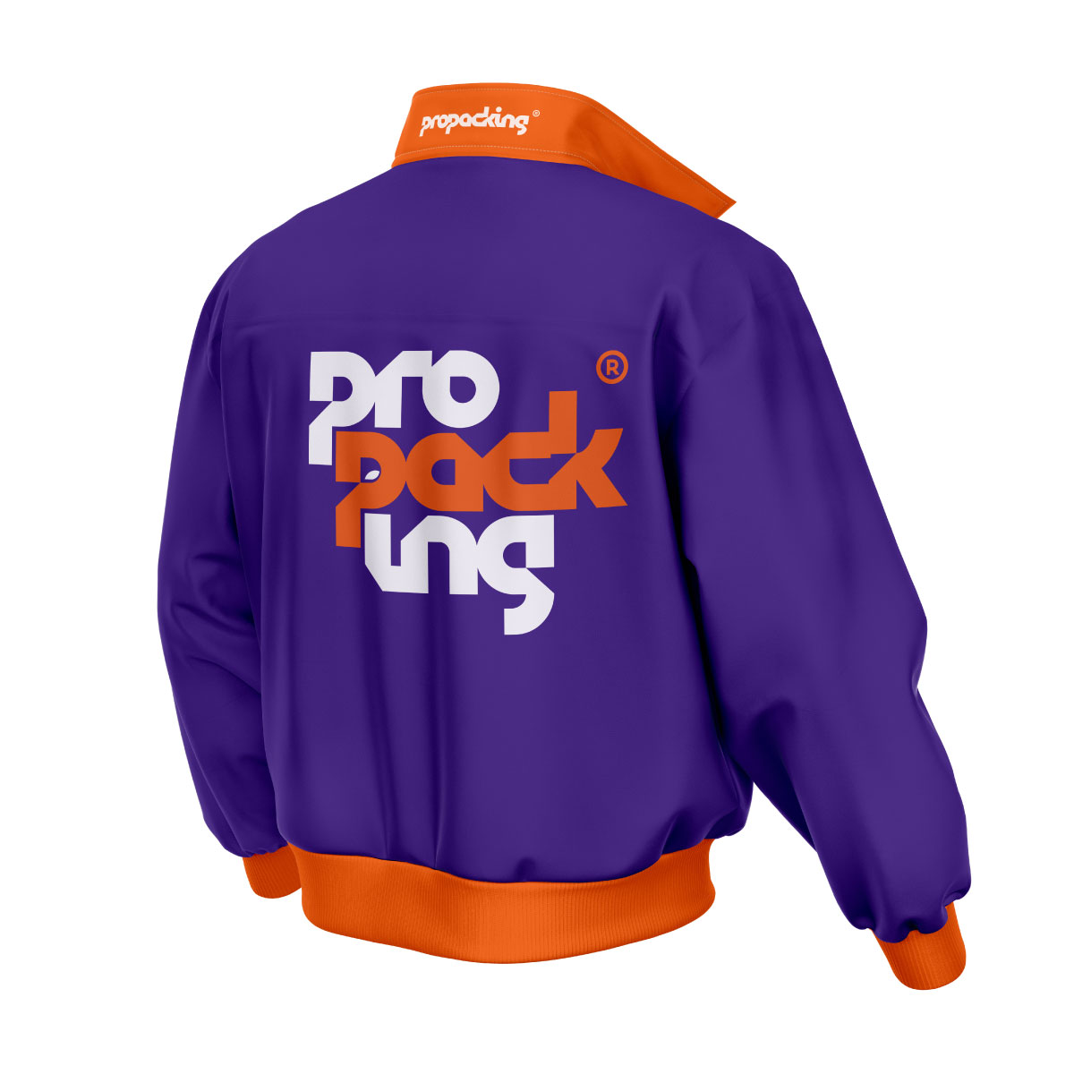
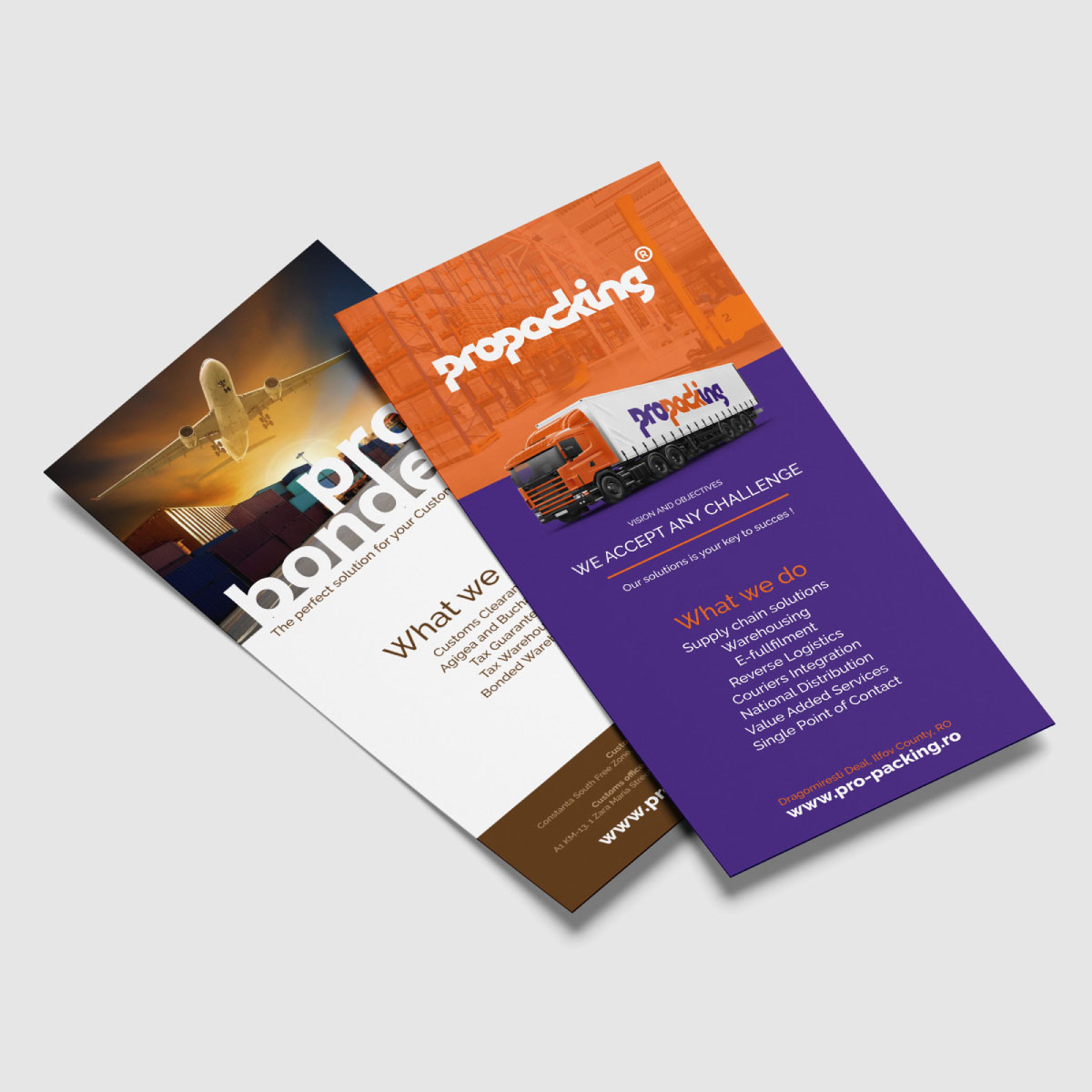
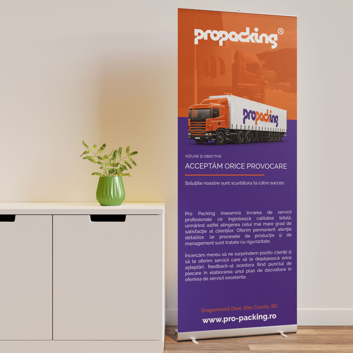
Signature colors: orange and blue – two powerful shades full of meaning. Orange symbolizes energy, dynamism, and the team’s proactive approach, while blue inspires trust, stability, and professionalism—essential values in a sector where precision and efficiency come first.
We extended this visual identity by customizing their vehicle fleet to stand out on the road and strengthen brand cohesion. We also designed personalized uniforms for the team and outfitted their warehouse with tailored signage, transforming the space into a functional and inspiring environment.
For their market presence, we produced high-quality printed materials and exhibition setups for key industry events. Every asset, whether a flyer, banner, or exhibition system, reflects the essence of Pro Packing Adventure: innovation, dedication, and an unwavering commitment to excellence.
Client
Pro Packing Logistics
Services
Branding, Graphic Design, Web Development
Year
2021