
Visual Identity Created with Empathy and Vision
SanoKids Clinic
The SanoKids Clinic project began with the warm energy and genuine enthusiasm of the founder, who wanted a logo capable of instantly conveying the care, professionalism, and optimism of a modern pediatric clinic. She shared her desire to create a space where children feel safe and parents feel they are in good hands.
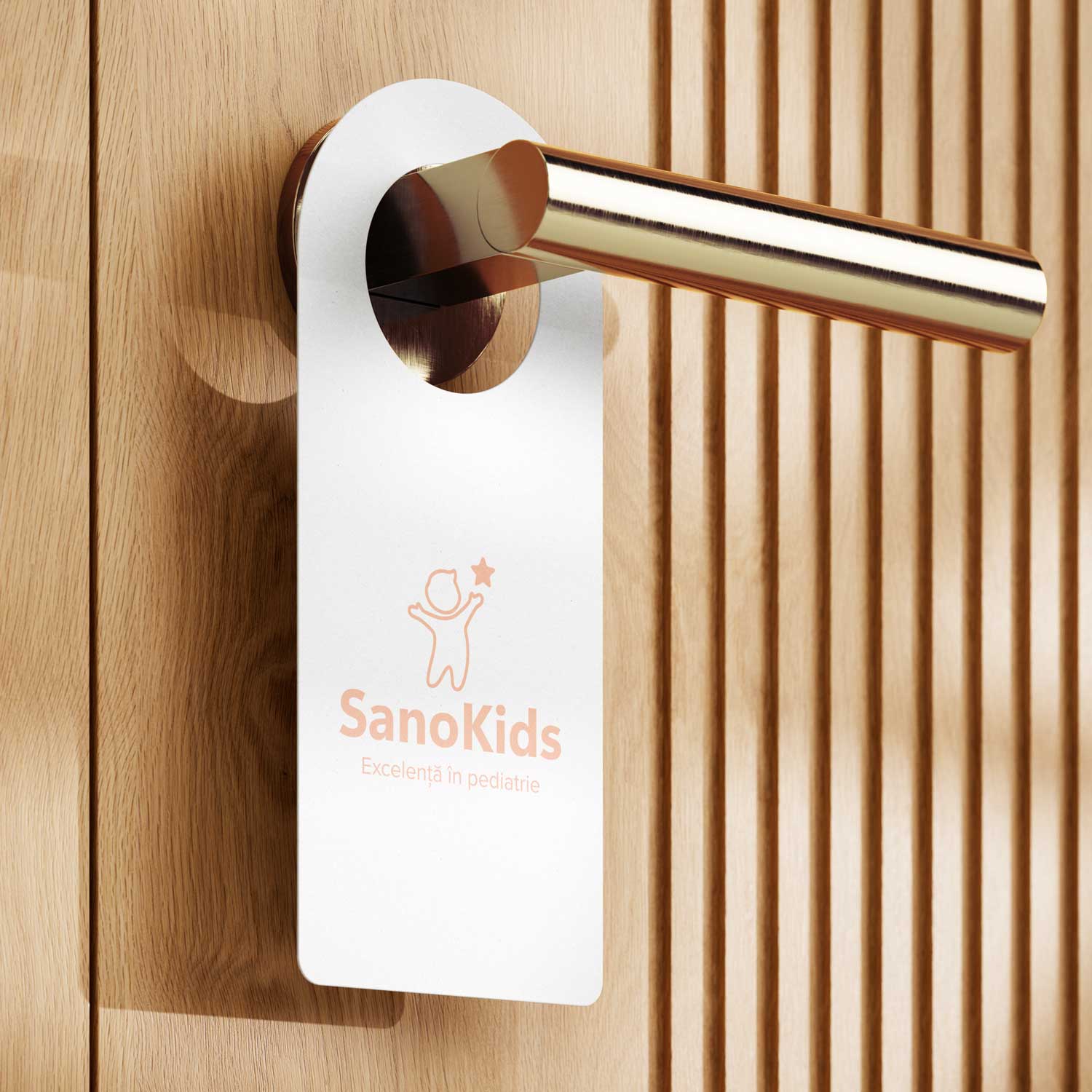
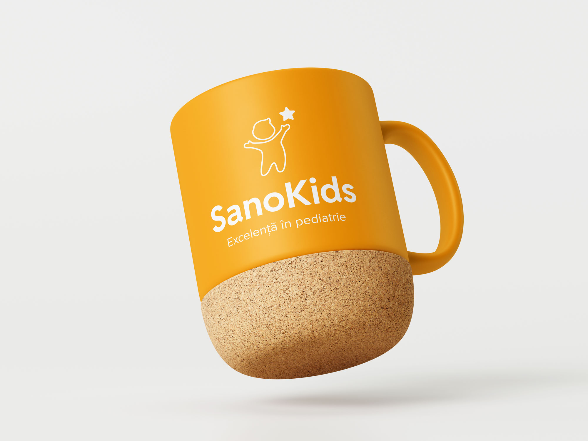
The creative process was an open and inspiring collaboration. We explored various visual directions together—from reinterpreted medical symbols to playful elements specific to childhood. Ultimately, the chosen logo captured the essence of the clinic best: a child raising their arms toward a star, a symbol of growth, hope, and healthy development.
The design is minimalist, warm, and memorable, built with rounded lines and pastel tones to reflect both the professionalism of medical practice and the sensitivity of the children’s world.
The result is a bright and strong visual identity, in harmony with the clinic’s values: care, excellence, and closeness to families. We are proud to have contributed to the launch of this brand and delighted to have transformed the founder’s vision into a truly memorable symbol.
Clients
SanoKids Clinic
Services
Branding
Year
2025