
10 Types of Logos + Interesting Examples. Which One Is Right for You?
Maybe you’re about to start your own company and keep hearing the word “logo” everywhere. But what does it actually mean? What is a logo? What are the different types of logos? Which type should you choose for your business? What are the advantages and disadvantages of each?
In this article, we break down all the main types of logos, provide examples, and give you practical guidance to help you decide what fits you best.
Here’s a quick overview to easily navigate through the sections and learn the essentials in just a few minutes… and let’s get started:
What is a logo?
A logo can be an image, text, shape, abstraction, or a combination of these elements, used to represent a business. It acts as a visual mark that can be applied across various materials — from products to business cards and stationery — helping users identify the brand.
Most importantly, one of the key functions of a logo is to evoke a specific emotion and create a mental association in the user’s mind.
For example, think about the Nike “swoosh” (the logo) — it is recognized by most people without needing to explain that it represents the Nike brand. It also suggests movement, speed, and agility through its curved and dynamic shape. It’s fair to say that it attracts, even subconsciously, its target audience — active people who enjoy sports and are constantly on the move.
Now, let’s break down the different types of logo design, explore their characteristics, ideal use cases, and give you relevant examples:
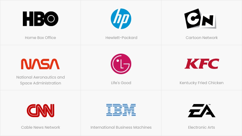
1. Monogram Logo / Lettermark
A monogram logo, also known as a lettermark, consists of a single letter or a combination of letters — usually the initials of a company. It is most commonly used when the company name is too long, so it’s represented only through its initials.
✔️ Advantages
- Simplifies complex or long names
- Fits better across different spaces and sizes
- Easier to remember than a symbol, for example
- Easy to reproduce across various materials, which is beneficial for new and growing businesses
❌ Disadvantages
- May not be easily readable
- Can look similar to many others
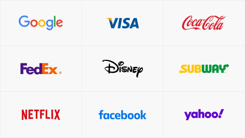
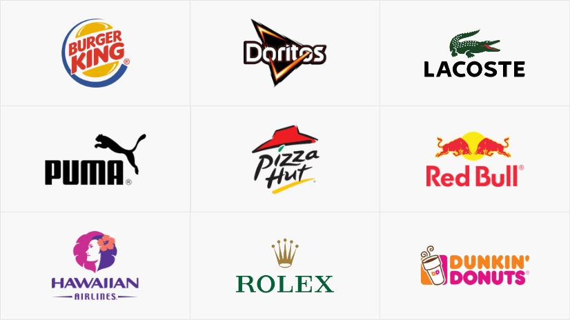
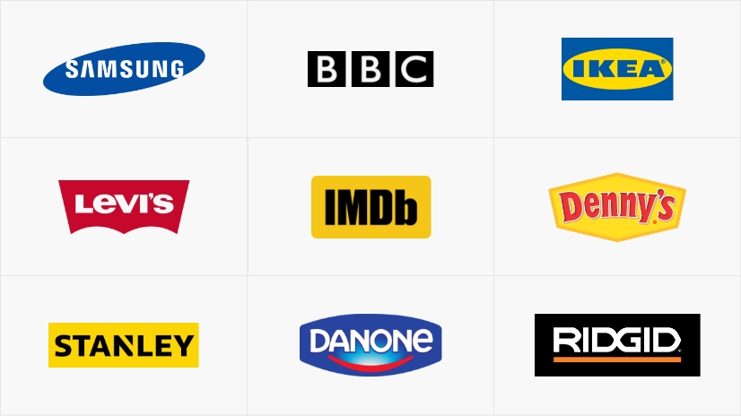
2. Logo Wordmark
A wordmark logo (also called a logotype) is similar to a lettermark, but this time it includes the full company name. It is a font-based logo and is mainly used by companies with unique names. The brand name itself becomes the visual identity, using distinctive typography (fonts and letterforms).
✔️ Advantages
- Makes the brand name easy to remember
- Simple to use
- Requires fewer variations and changes over time compared to other types of logos
❌ Disadvantages
- May look generic if not executed properly — use unique fonts and a distinctive color combination to stand out from competitors
3. Abstract Logo
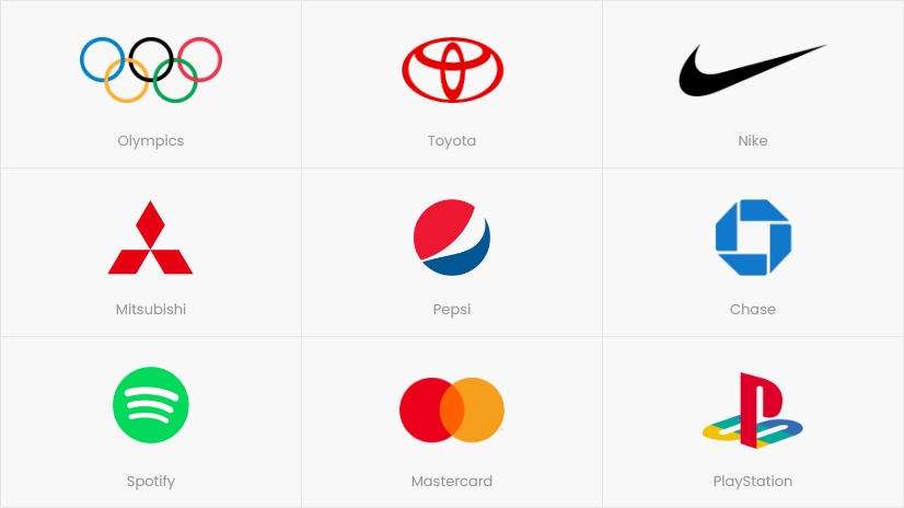
Companies often choose abstract logos to capture attention. The product or service is represented through a symbol or icon — visually appealing and easy to remember. In short, it communicates a complex idea through a simple shape, symbol, or visual concept.
Most commonly, these logos are built using geometric shapes in various compositions and combinations.
If you can clearly recognize the symbol/icon as a real-world object, then it’s not abstract — it’s a pictorial logo.
✔️ Advantages
- Works well for large companies with multiple divisions operating across different industries
- Highly effective for technology companies
❌ Disadvantages
- Difficult to execute correctly
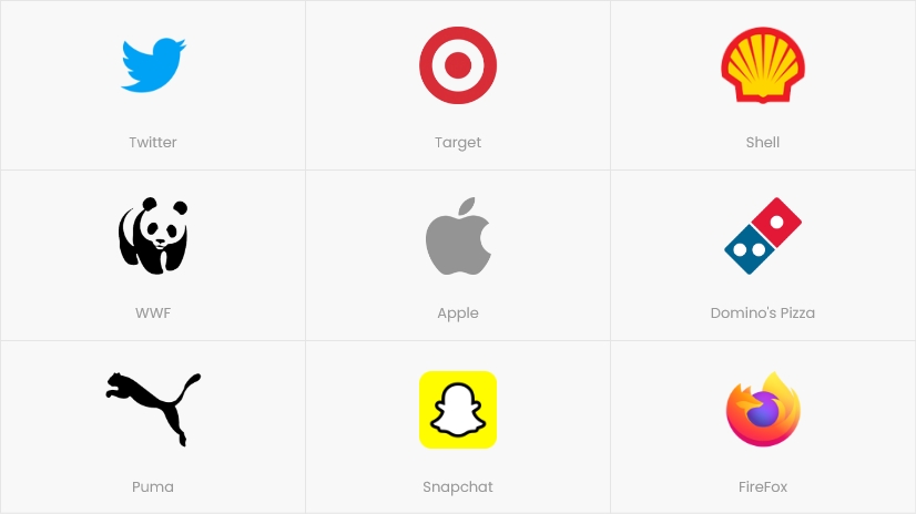
4. Pictorial Logo
A pictorial logo is a stylized and simplified image — an illustration that is instantly recognizable. Well-known examples include Apple’s apple icon and Twitter’s bird logo.
This type of logo is popular because it communicates more about a brand than just text or an abstract shape. It relies on the associations people naturally make. Visuals and images are also easier to remember, which strengthens recognition.
Often, pictorial logos suggest the company’s mission and make a strong, clear statement.
✔️ Advantages
- Visually appealing
- Can be highly original
- Symbolic and capable of evoking a specific emotion
- Extremely expressive, communicating a promise, emotion, or offering
- Excellent for global businesses, as it doesn’t require users to read or pronounce complex names (like wordmarks)
- Suitable for representing multiple products or services
- Very distinctive
- Can be simple — something emblem logos, for example, often cannot achieve
❌ Disadvantages
- Without a wordmark, it may be difficult to recognize as a brand when new — requires marketing investment
- If you’re a barber, chef, hairstylist, etc., it can be difficult to create a pictorial logo that reflects your profession and stands out
- Sometimes it can be too abstract or ambiguous for concrete professions, services, or products
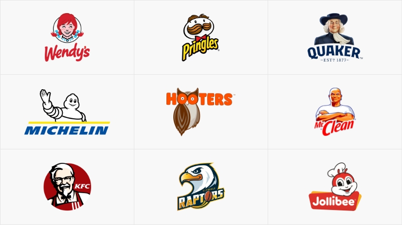
5. Mascot Logo
A mascot logo primarily uses illustrations and characters as its central element.
They are vibrant, colorful, playful, and friendly. Many companies in the children’s products industry, food businesses, and sports teams use mascot logos because they attract attention and are among the most approachable types of logos.
Most importantly, this type of logo helps customers build a connection with your brand and identify with the character, almost like with a human personality.
✔️ Advantages
- Excellent for attracting children and families
- Friendly, warm, and brings a smile to users
- Feels more approachable, which appeals to large audiences
- Fun and engaging
❌ Disadvantages
- Difficult to use when targeting corporate clients
- Hard to integrate into premium or luxury products/services (as it feels more accessible)
- Requires a skilled designer to create the illustration
- Often needs updates over time to stay aligned with evolving audience preferences
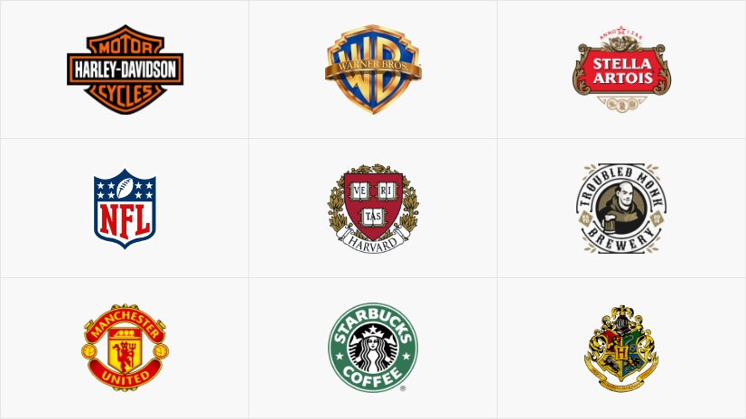
6. Emblem Logo
Emblems have a long history — families, castles, and universities have used them for centuries.
Because of this, emblem logos evoke a sense of reliability and a feeling of permanence.
They typically combine text, a symbol, and a geometric shape, creating a strong and solid visual identity.
✔️ Advantages
- Easy to reproduce on badges, seals, and crests
- Ideal for traditional companies, universities, government agencies, and institutions
- Suitable if you want to position your brand as “classic” or “distinctive”
- Perfect for beer and coffee brands
- Highly original and difficult to imitate, making it hard to confuse
❌ Disadvantages
- Current trends lean toward simplicity and “less is more”; emblem logos can easily become too complex due to multiple elements
- Not suitable for all types of businesses — mainly limited to traditional brands
7. Combination Mark Logo
This type of logo is a combination of pictorial logos and wordmarks.
The elements can be placed side by side, stacked, or integrated together.
✔️ Advantages
- Helps you stand out from competitors (for example, many brands may use a bear as a pictorial logo, but adding text reduces confusion)
- Increases memorability — the viewer retains both an image and a name
- Ideal for new companies that are not yet established in the market
- Once established, people can recognize you either by the symbol or the text
- Preferred by manufacturers — stands out well on retail shelves
❌ Disadvantages
- You now have two elements to design, which must work well together
- Can be harder to adapt across different formats and mediums
- The company may need to decide when to use the symbol or the text, which can sometimes create inconsistency
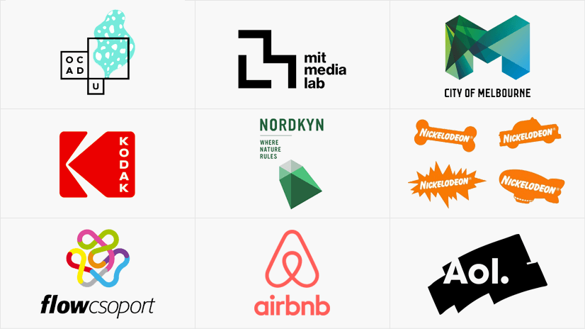
8. Dynamic / Adaptive Logos
It is one of the most modern types of logos, characterized by movement, animation, and changes in form and structure depending on the context in which it is used.
✔️ Advantages
- Used by many innovative and dynamic companies to convey agility, movement, constant change, and evolution
- Helps users navigate changes in context and situations (festivals, forums, events)
- Offers variety and flexibility
- Feels fresh and different — movement naturally attracts attention
- Often preferred by large, innovative companies with multiple divisions and diverse products/services
❌ Disadvantages
- Difficult to maintain consistency across different logo variations
- Harder to communicate a clear, stable message (what does the change represent?)
- Challenging to design a complex symbol that remains recognizable in multiple forms and variations
9. Contoured Words Logo
Contoured words logos are very similar to wordmark logos — they still include the company name, but this time it is combined with an interesting shape alongside the typography.
This gives companies the opportunity to use more colors and create a more expressive visual identity. Rounded shapes can convey friendliness and approachability, while rectangular shapes, in the language of forms, suggest stability and reliability.
✔️ Advantages
- Communicates more through the inclusion of shapes in the design
- Feels less strict and formal, making it more approachable
- Commonly used by home goods brands to express availability, comfort, and accessibility
❌ Disadvantages
- Can be difficult to compose and place across different formats due to the extra space they occupy
- Achieving good contrast between shapes and typography can be challenging if not designed properly
10. Slime Logo
This type of logo is characterized by a hand-drawn style, with splashes, dots, and dripping effects. It’s relatively new compared to more traditional styles.
Instead of using conventional fonts and symbols, these logos incorporate slime-inspired elements and a more organic feel. In short, they are playful and fun.
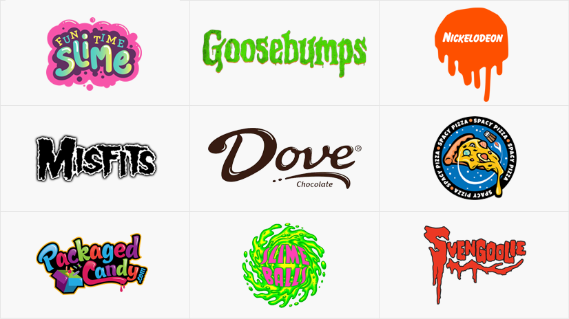
✔️ Advantages
- Highly appealing for products and services aimed at children
- Fresh style, with the market not yet saturated with this type of logo
❌ Disadvantages
- Not suitable for more corporate companies, making its use more limited
- If not executed properly, it can be difficult to read, remember, and recognize
Which Type of Logo Is Right for You?
We hope this article has given you a clear overview of the different types of logos and helped you make a more informed decision for your brand. Here’s a quick checklist you can go through in just a few minutes to determine what fits you best:
Is your business name short or long?
Consider a wordmark or contoured words logo vs. a monogram/lettermark.
Are you a more traditional business or an innovative one?
Consider an emblem logo vs. an abstract or dynamic logo.
Are you a playful, family-oriented brand or a more serious, corporate one?
In this case, a mascot logo or slime logo vs. a wordmark might be the right fit.
Are you new to the market or already somewhat established?
You can try a mascot, combination mark, or wordmark vs. a dynamic, abstract, or pictorial logo.